If you’re looking to create an ad graphic in Photoshop, you’ve come to the right place. Whether you’re a seasoned pro or a beginner, Photoshop is a powerful tool for creating stunning graphics that can help your brand stand out. In this article, we’ll take you through the step-by-step process of creating an ad graphic in Photoshop.
First things first: make sure you have Photoshop installed on your computer. Once you have it up and running, open a new document and set the dimensions to match the size of your desired ad graphic. Next, choose a background color or image that will complement your brand’s colors and messaging. From there, add any additional elements such as text or images that will help convey your message.
One important thing to keep in mind when creating an ad graphic in Photoshop is to use high-quality images and graphics.
Most internet users today have grown so used to ads that unless the ad is visually stunning, website visitors will be totally oblivious. An effective ad graphic makes use of the following:
For those that work in the design industry, we are all to familiar with having to establish an advertising campaign for products. No matter the product, it’s up to you to convince the potential buyer that this product is worth their money. Successful advertising can make or break a product. Apple is a great example of this: They generate a lot of product hype and develop gorgeous ads for their products well before they come out. As a result, Apple can convince consumers to pay ridiculous amounts of money for their products.
Ad Graphic in Photoshop
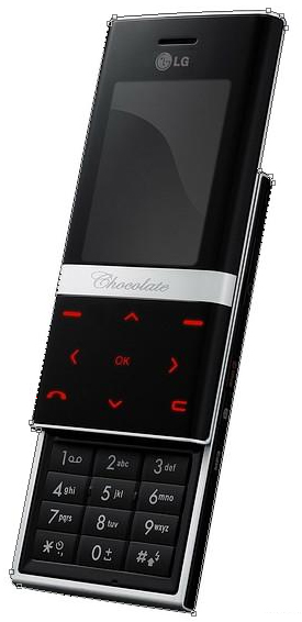
In this tutorial, I’ll show you a few techniques on how to creating an ad graphic in Photoshop that may improve your design abilities when creating advertisements. One of the best ways to hone your skills is to practice making Ads for products that you’ve never seen advertised before (or simply don’t exist at all). More than likely won’t be swayed into copying their style. For this tutorial, I’ll demonstrate with the LG KE800 Chocolate Platinum.

Extracting the Phone
We will be extracting the product alone from its background using a vector mask. This extraction technique works great for most objects since it produces crisp edges. Select the pen tool by pressing “P” or by clicking the Pen Tool icon in the toolbox. Make sure you have it set to “Paths” mode before you start. This option is located in the Options Panel at the top of the screen (this will create a vector path, but with no fills or strokes applied to it).


Now add anchors along the outline of the object. If you’re new to using this tool, check out the Pen Tool Basics Tutorial. Once you have the phone outlined it should look like this:

Now go to Layer > Vector Mask > Current Path. This will create a vector Mask utilizing the path we just created. So now we have the phone cutout.
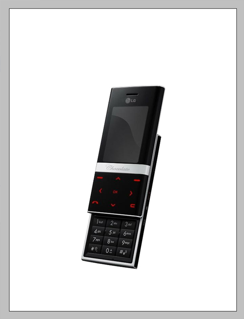
Setting Up a Spread
Now that we have the phone we will set up our document. We are going to assume that this is for Web use and will create a document with the following size:

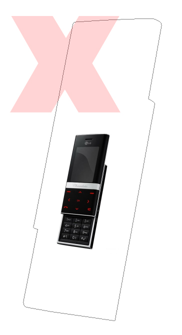
Go ahead and drop the image into your new canvas and scale it up to be a bit larger (Edit > Transform > Scale). When making an Ad for a product you usually want the product to be the most striking part of the image. If you try to scale the object and the phone does not change in size, but rather its mask does, you need to deselect the mask and make sure you are selecting the actual phone graphic. (Refer to images below.)
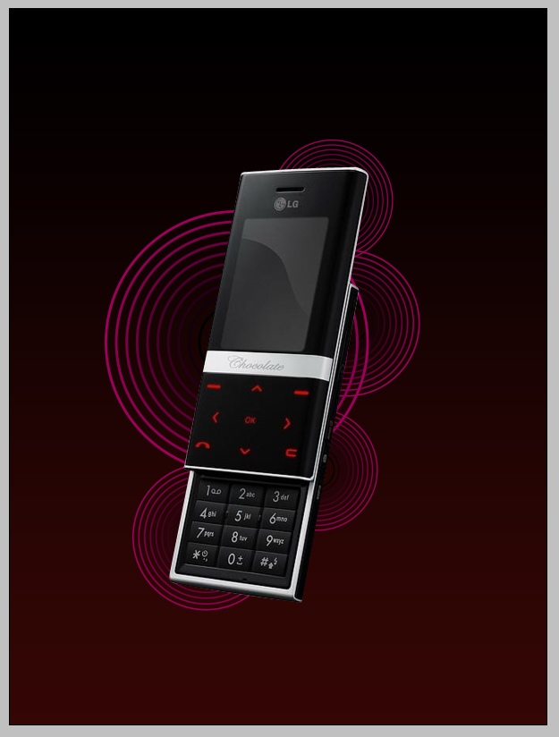
Making a Background
Double click the background layer and hit OK to unlock it. Now double click the layer again to open the Layer Blending Options Panel. We want to add a Gradient that subtly fades from black to dark red. Using the eyedropper tool, you can get select colors from your graphic. This helps keep everything in the same tonal range. After finding a red from the buttons I darkened it a bit more.


Making a Repeating Circle
In this step, we are going to use the shape blend tool in Adobe Illustrator to make some interesting shapes in the background. Let’s hop over into Adobe Illustrator to make some vector graphics. Create two circles, one smaller than the other. Also, color the inner one black and the outer one a maroon color. Make sure they are centered. Next press “W” for the blend tool, or hit the button on the toolbox. Click the circle’s paths starting with the inner one.


You should get a series of circles blending both shape and color. If you double click the Shape Blend tool in the toolbox you will get a dialog box. Change the spacing to specified steps, and the number between 8-12.


Now select the object and copy it. Switch back into Photoshop and paste it into the Ad. You can leave Illustrator open because we will return to it soon. When you get the Paste dialog box choose smart object and hit ok. This will leave the object as vector and therefor will be more versatile when working with it. Play around with placement and size and come up with some sort of background for it to sit on. This is what I came up with:
Adding Flourishes
Thats right. As trend whore as they may be, they can allow for amazing artistic originality. I would stray away from using nothing but brushes made by other people, but it’s always Ok to collaborate with their consent. In this tutorial we will be making our own. Select the Brush tool and change the Brush tip shape to a small soft brush. Open the brush settings and change them to the following:


Now select the Pen Tool and draw swoosh shapes around the phone, like below. Make sure you add a new layer to work on before doing the next step.

Right-click the path with the Pen tool still selected and select Stroke Path. Make sure simulate brush pressure is turned on and click OK.


Double click the layer that you applied the stroke on to get to its Blending options. Add a gradient like this:

Next add a glow like this:

Play around with some different strokes and get some interesting flow of lines. Guide the viewer’s eye around the product. This is what I came up with:

Making a Custom Brush
Next we are going to make a custom brush to treat the graphic further. I will be using a flower because I want to play off of the sensual nature of this phone. Think of your audience, if you personify the ad make sure it is to your benefit. Find a good stock image of a flower and open it in Photoshop. Go ahead and extract the flower using the technique shown in the beginning of this tutorial. You should end up with something like this:

Crop it in nice and tight and select Edit > Define Brush Preset.

Now you have the flower saved as a brush, which will speed things up when we are illustrating. So go and add some cool effects with the brush tool. This is what I came up with for this ad graphic in Photoshop:

(I used the symbol sprayer in Illustrator. You may need to play with brush colors if working in Photoshop.) To finalize the image lets throw some text on it and play with the lighting a bit. By using the Dodge and Burn tools you can add shadows and highlight to the various layers and further control the viewer’s attention.
Results
This is the final result for creating an ad graphic in Photoshop.
